Project details

Client:
Rukmini Vijaykumar | Indian Classical dancer & Actor
Tool:
Adobe Indesign, Adobe Illustrator, Adobe Photoshop
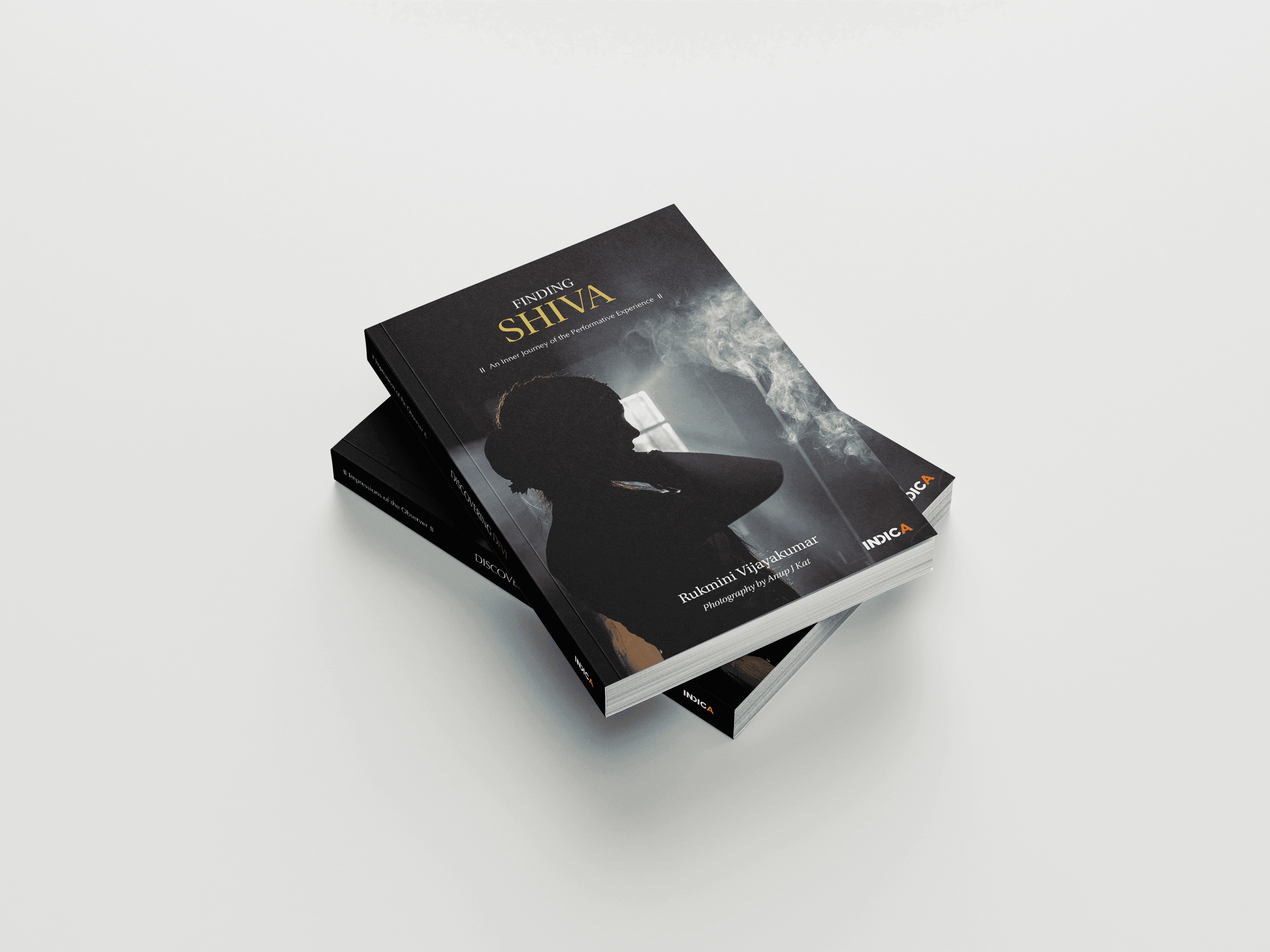
A dual-book project exploring the journey of a dancer through the lens of tradition and transformation. The narrative unfolds across two perspectives — past and present — translated into a cohesive visual and typographic system.
Role
Typography system design
Photo sequencing
Book cover design
Concept
The project began as a single book but evolved into a two-book format to better represent:
Dual narrative perspectives
Physical usability
Distribution and shipping considerations
This separation allowed each book to hold its own emotional and visual identity while remaining part of a unified system.
Design Direction
The visual language is rooted in:
Contrast between light and shadow
Stillness vs movement
Tradition vs modernity
The imagery and layouts were designed to mirror the dancer’s internal and external transformation.


Design Thinking Process
Typography System:
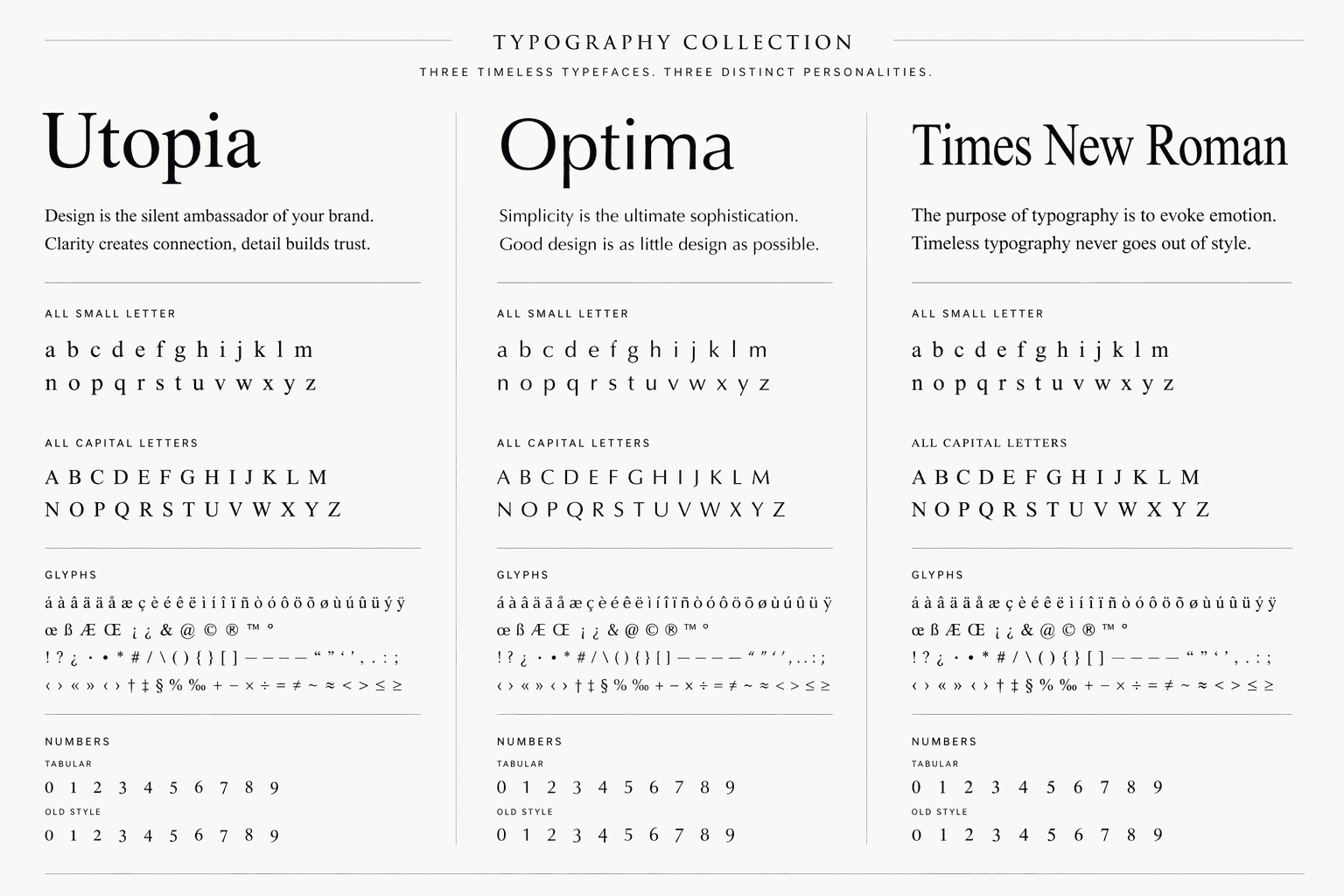
A layered typographic approach was used to reflect time and identity:
Utopia (Primary Typeface)
I chose Utopia as the primary typeface for its ability to bridge tradition and the contemporary moment. As a serif, it carries a sense of structure, depth, and intellectual weight—qualities that resonate with the conceptual foundation of the project.
What drew me specifically to Utopia is its finely articulated details—the subtle curves, sharp terminals, and nuanced contrast in stroke. These characteristics mirror the complexity of present-day experiences. Just as the typeface reveals richness upon closer observation, our current reality is layered, intricate, and shaped by increasingly detailed interactions.
In this way, Utopia becomes more than a stylistic choice—it acts as a visual metaphor. It reflects a world where clarity and complexity coexist, grounding the design in both timelessness and contemporary relevance.
Optima (Supporting Typeface)
I chose Optima to represent the past, as its form sits between serif and sans serif—quietly echoing a transition between time periods. It carries the softness and restraint of something remembered rather than experienced in the present.Its gentle modulation, open shapes, and absence of sharp terminals give it a calm, reflective quality—much like memory itself. Optima doesn’t demand attention; it lingers subtly, allowing the content to feel distant yet intimate. In this way, the typeface becomes a visual metaphor for the past—fluid, softened over time, and held together by a sense of quiet continuity.
Times New Roman (Special Typeface)
Used for transliterations (Tamil & Sanskrit)
Ensures accuracy and readability of complex glyphs


Content Structuring
A physical navigation system was introduced during prototyping:
Green stickers → Beginning of a section
Yellow stickers→ End of a section
Pink stickers → Centre spreads
This helped map pacing, rhythm, and narrative flow across the book.
Layout Design Decisions
I used Natyashastra geometry as the underlying grid to root the layout in the same principles that govern classical movement—balance, direction, and rhythm.
The circular, axial, and proportional structures guide visual flow across the spread, mirroring how a dancer’s body moves through space and focus.
This transforms the book from a static reading experience into a choreographed visual journey, where content, form, and meaning move in harmony.
Print Specification
Coffee Table Book
Size: 9.4” × 13.5”
Hard case with dust jacket
Matte lamination
Mont Blanc 160 gsm paper
Offset printing
Novel Format
Size: 5” × 8”
Soft cover with matte lamination
NS Seshai 70 gsm paper
Digital print-on-demand


