Project details

Client:
Ivy Avenue | Jewellery Brand Indenity Design
Tool:
Adobe Illustrator, Adobe Photoshop
Overview
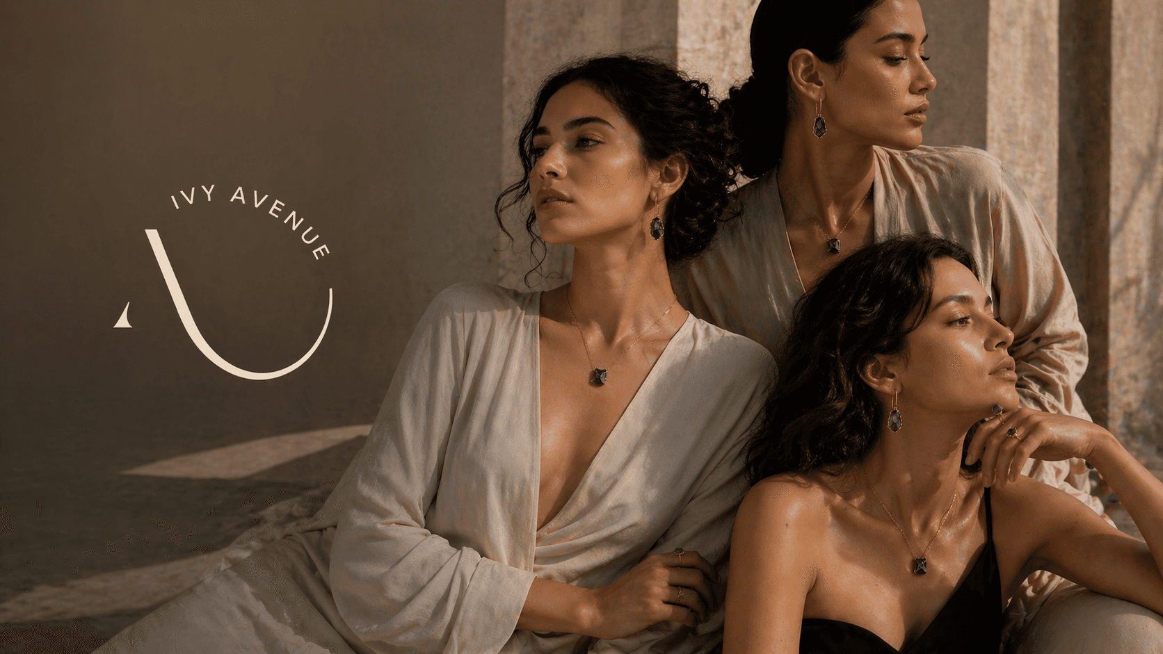
Ivy Avenue is a conceptual luxury jewellery brand built around the idea of timeless elegance for modern women.
This project focuses on crafting a cohesive brand from the ground up — defining its vision, positioning, and visual identity.
The Idea
The name “Ivy” represents eternity and growth, while “Avenue” symbolises a journey — together forming a brand that sits between evolving trends and lasting design.
The goal was to create a brand that feels:
Minimal yet expressive
Modern yet timeless
Refined yet approachable
Brand Positioning
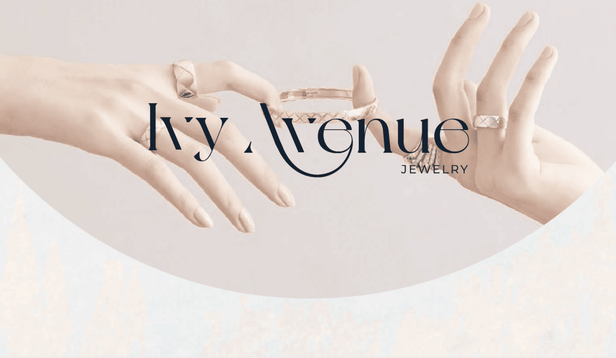
Ivy Avenue is positioned as a modern luxury jewellery brand that blends handcrafted detailing with a clean, editorial aesthetic.
Core focus:
Uncut stone jewellery as a unique identity
Everyday luxury with a premium feel
Design-led storytelling over heavy ornamentation


Creative Direction
The brand is built on four key pillars:
Luxury — understated and quiet
Modern — structured and minimal
Unique — raw, organic elements
Classic — timeless visual language
Every design decision was guided by balancing these contrasting yet complementary traits.
Moodboard & Visual Language.
The colors explores a blend of:
Soft neutral textures
Natural light and shadows
Editorial jewellery photography
Raw stones paired with polished finishes
Subtle contrasts between organic and structured elements
This creates a visual world that feels calm, premium, and intimate, rather than overly commercial.

Typography System
The typography pairing was designed to balance elegance with readability:
• Primary Typeface (Serif – New York):
Adds sophistication and timeless appeal with high contrast strokes
• Secondary Typeface (Sans Serif – Montserrat):
Brings clarity, structure, and modern balance
This combination ensures the brand feels both editorial and contemporary.
Color Palette
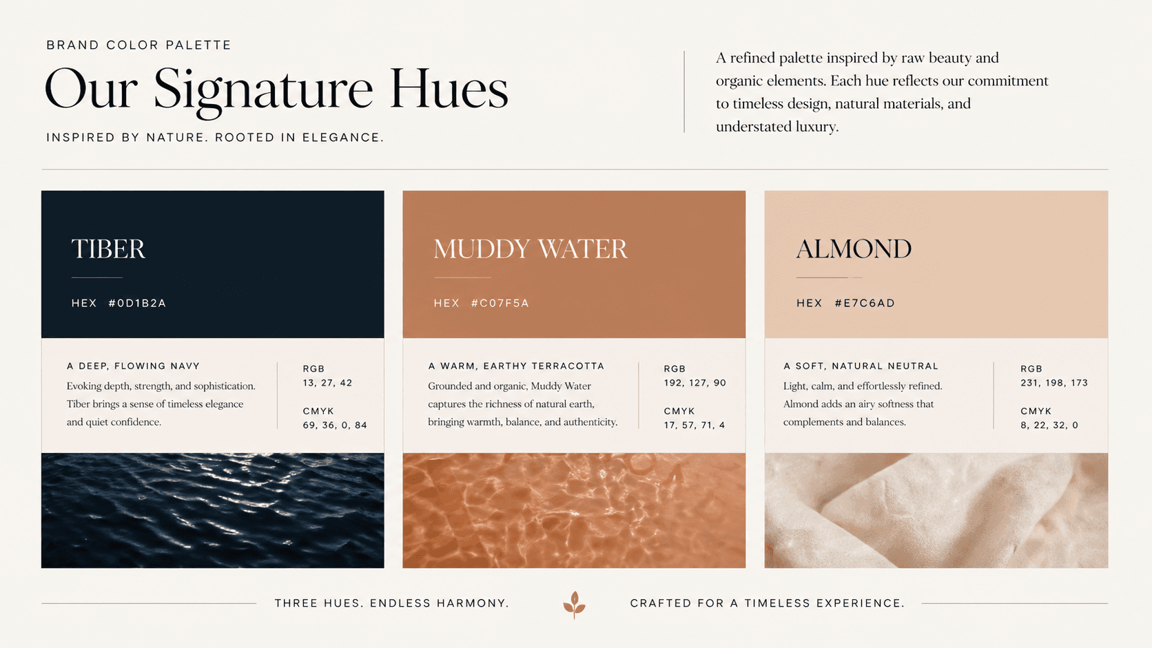
The colors are intentionally muted and refined:
Deep Navy (Tiber): Strength, depth, premium feel
Warm Beige (Almond): Softness, femininity, calm luxury
Muted Brown (Muddy Water): Earthiness, grounding the brand
The colors work together to create a quiet luxury aesthetic that avoids visual noise.
Identity Design
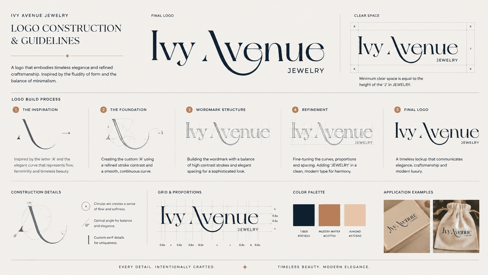
The logo system is minimal yet distinctive, focusing on:
Fluid curves that reflect grace and continuity
Subtle detailing to maintain uniqueness without excess
Scalability across print and digital applications
The identity is designed to feel recognisable yet understated.
Outcome
The final brand system delivers:
A cohesive identity across all touchpoints
A strong visual language rooted in minimal luxury
A scalable design system adaptable for digital and physical mediums
A brand that feels timeless yet relevant to modern audiences
Key Learnings
Minimal design requires strong conceptual clarity
Consistency across touchpoints builds brand credibility
Luxury is often communicated through restraint, not excess
Balancing modern and classic elements creates lasting appeal


